Loading
Watercolor Daily · Guides
Glazing Watercolor Technique: 6 Steps to Layer Clean Color
12 min readBy Marcus Reed
Review
Watercolor Glazing
Glazing watercolor technique is the simplest way to get colors that look lit from inside. You paint one thin, transparent wash, let it dry completely, then paint another over it. The two layers mix in the eye instead of on the palette, and the white paper shines up through both.
The method is easy. What trips people up is pigment choice, drying time and brush handling, and each of those has a rule you can learn in a minute. This guide gives the six steps, the pigments that glaze cleanly, and the mistakes that turn a glaze to mud.
In short: Paint the lightest color first, let it dry bone dry, then lay a thin wash of a transparent color over it in one pass with a soft brush. Use staining transparents such as Phthalo Blue (PB15:3) and Quinacridone Rose (PV19) for the first layers because they stay put once dry. Save the second pass of a brush, and opaque or heavily granulating colors, for the top. Three or four glazes is usually the limit before the glow goes.
What is the glazing watercolor technique? (quick answer)
Glazing is painting a thin, transparent wash over a layer of color that has already dried, so the lower color shows through the upper one. Daniel Smith's beginner guide defines it as a technique of color mixing that is especially luminous with transparent watercolors: after applying some color and allowing it to dry, you brush over that color with a wash of a different transparent color.
Overview
Every watercolor wash is a thin film of pigment on white paper. Light passes through the film, bounces off the paper and comes back through the film to your eye. That is why a watercolor glows in a way a thick opaque paint does not. Glazing stacks two or more of those films. Light passes through all of them, so you see a mixture, but a different kind of mixture from one made on the palette.
Daniel Smith's tutorial by the painter Caroline Buchanan puts it as sound. A mixed color is one note. A glazed color is a chord: the lower hue shows through the upper one, and the eye reads both at once. A blue laid over a dried red, in her example, may land on the same violet as a palette mix, but with the red still visible through the blue.
The practical use of the glazing watercolor technique is control. You can judge a value as each layer dries, add another glaze if it needs to go darker, and stop when it is right. A single heavy wash gives you one chance. This is also the technique for shadows: a thin glaze of blue over a dry object darkens it while leaving its color intact.
The whole glazing watercolor technique depends on dry paper and transparent paint. The sections below cover which pigments to use and how to lay each layer.
Which Pigments Glaze Cleanly and Which Make Mud
Daniel Smith lists four properties for every color: transparency, granulation, staining and lightfastness. Two of them decide how a paint behaves in the glazing watercolor technique.
Transparency decides whether the lower layer shows through. Transparent pigments let the white paper and the underlayer shine up. Opaque ones sit on top and hide what's below. Daniel Smith rates Phthalo Blue Green Shade (PB15:3), Phthalo Green Blue Shade (PG7), Quinacridone Rose (PV19) and French Ultramarine (PB29) as transparent, and Hansa Yellow Medium (PY97) and Pyrrol Scarlet (PR255) as semi-transparent. Semi-transparent colors glaze well in thin washes. Opaque ones such as the cadmiums and most whites don't.
Staining decides whether the lower layer stays put when you brush over it. Buchanan's tutorial says staining pigments stay down: once the first wash dries, you can glaze over them or work an area back and forth with several brushstrokes and they won't dissolve or mix with the fresh paint. The phthalos, the quinacridones and Hansa Yellow are on her staining list. Sedimentary and non-staining colors behave differently. She describes them dissolving under a third brushstroke so that they blend into the new color and leave a scar in the under-layer. That scar is what most painters call mud.
So the first layers want transparent stains, and the glazes on top can be almost anything thin. One warning from the same tutorial: stains glazed over stains are at best flat and at worst kill the color under them. Her example is Phthalo Blue over a strong Alizarin Crimson, which gives a dark, dead blue. Sedimentary colors glazed over a stain, by contrast, let minute glimpses of the lower color sparkle through, which is why she puts an ultramarine or cerulean second wash over a stained first wash in every sky.
The split-primary palette guide sorts the same six tubes by warm and cool. For glazing, sort them by staining and transparency instead.
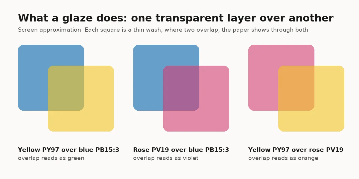 A screen approximation of what a glaze does. Where two thin washes overlap, the paper shows through both and the eye reads a third color.
Step-by-Step: Glazing Watercolor Technique in 6 Steps
1. Plan the order from light to dark. Decide which color goes down first. Daniel Smith's beginner guide says to begin with your lightest color washes, because transparent colors show like stained glass over the white of the paper. Yellow under blue reads as green. Blue under yellow reads as a dull, greyer green. 2. Paint the first wash with a transparent stain. Mix a thin, watery wash of a staining transparent such as Phthalo Blue (PB15:3), Hansa Yellow Medium (PY97) or Quinacridone Rose (PV19) and lay it in one pass. Keep it paler than you think you need. 3. Let it dry completely. Wait until the shine has gone and the paper feels room temperature, not cool, on the back of your hand. For a thin wash that is about 10 to 20 minutes. A hair dryer on low is fine, but let the sheet cool before the next step. 4. Mix the glaze thin. On the palette, mix the second color with enough water that you can see the palette through it. A glaze that is too strong hides the layer below instead of tinting it. 5. Lay the glaze in one pass. Load a soft round or mop, touch it to the paper and pull the wash across the area in a single stroke, or a few strokes that do not overlap. Do not go back over a spot. A second pass on damp paint is what lifts the underlayer. 6. Dry, judge, repeat. Let the glaze dry, look at the value, and add another thin glaze only if the area needs to go darker or shift in color. Stop while it still glows. Three or four glazes over one spot is usually the most a sheet will take before the result goes dull.
GODEEPER: Each glaze is a wet-on-dry wash, and the brush handling is the same. The wet-on-dry guide shows how to lay a flat wash without streaks or hard lines inside it. Wet-on-Dry Watercolor Technique: Crisp Edges in 6 Steps →
Tips for Glazing Without Mud
Stains first, sediments second, luminous last. This is Buchanan's working order for the glazing watercolor technique. Use stains and quinacridones in the first wash for flow and depth, sedimentary colors over them for sparkle, and the gentle transparents such as Cobalt Blue, Aureolin and Viridian for fine-tuning at the end.
One brush for the glaze, one for mixing. Mix the glaze with any brush, then switch to a clean soft brush that has only the glaze in it. A brush with leftover pigment in the ferrule will drop it into the wash.
Glaze a complementary color to calm an area. A thin glaze of the opposite color on the wheel, blue over orange or rose over green, lowers the intensity without turning it grey, as long as it is thin. The wet-on-wet guide shows the other way to soften an area, by blending on damp paper, which gives a softer edge.
Paint a glazing chart once. Lay horizontal stripes of each of your tubes, let them dry, then paint vertical stripes of the same colors across them. Every square where two cross is a glaze you can look up later. It takes half an hour and answers the question "what does this over that look like" for good.
Keep the paper flat. A sheet that buckles between glazes pools the next wash in the valleys. Work on a block glued on four sides or stretch the sheet first.
Cotton over cellulose. Gelatin-sized cotton paper takes repeated wetting without the surface breaking down. Cheap pads pill after two or three glazes, and the pilling shows as dull patches.
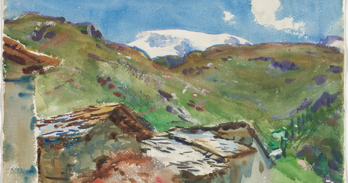
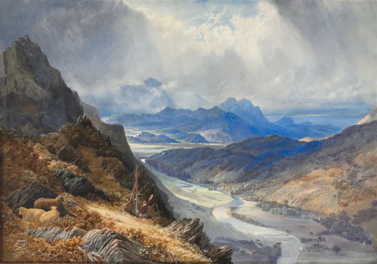 J. M. W. Turner, A View from Moel Cynwich, c. 1850, watercolor. The Cleveland Museum of Art, CC0. The hills and sky are thin layers over each other, and the lightest passages are the paper showing through all of them.
Glazing Watercolor Technique Mistakes
Glazing over damp paint. The most common one. The lower layer re-wets, mixes into the glaze and dries as a streaky mud. Wait until the back of the sheet feels room temperature.
Scrubbing. Going back over a glaze while it is wet drags the underlayer up, especially if the underlayer is non-staining. One pass, then leave it.
Glazing too strong. A glaze should be a tint, not a cover. If you can't see the underlayer through the wet glaze on the paper, it is too thick.
Stacking opaques. Opaque and heavily sedimentary colors glazed over each other build a dense, chalky layer. Buchanan's second wash of sedimentary colors over sedimentary colors went, in her words, too heavy. Keep opaque colors for a single final layer or leave them out of a glazed passage.
Wrong order. A dark staining color under a pale glaze can't be lightened afterward. Plan from light to dark and glaze upward.
Stain over stain at full strength. A strong phthalo over a strong quinacridone or alizarin goes dark and flat. If both colors are stains, keep at least one of them thin.
GODEEPER: Lifting is the opposite move, taking color off a dried wash instead of adding to it. The snow guide shows when to lift and when to leave the paper white. How to Paint Snow in Watercolor: 9 Tips for Clean Whites →
Frequently Asked Questions
What is glazing in watercolor? Glazing is painting a thin, transparent wash of one color over another color that has fully dried. The two layers mix in the eye rather than on the palette, so a yellow glaze over a dry blue reads as green while both colors still show. Daniel Smith describes it as a technique of color mixing that is especially luminous with transparent watercolors.
Which watercolor pigments are best for glazing? Transparent, staining pigments for the first layers and transparent non-staining ones for the last. Phthalo Blue (PB15:3), Phthalo Green (PG7) and the quinacridones such as Quinacridone Rose (PV19) stay put once dry and glaze cleanly. Opaque or heavily sedimentary colors glazed several times over each other go dense and muddy.
How long should watercolor dry before glazing? Until the paper is bone dry, which usually means 10 to 20 minutes for a thin wash in a normal room and longer for a wet one. Test the back of the sheet with your hand. If it feels cool, water is still in it. A hair dryer on low speeds this up, but let the paper cool before you glaze.
Why does my watercolor glaze lift the layer underneath? Either the underlayer wasn't fully dry, the brush went over the same spot more than once, or the underlayer was a non-staining pigment that re-wets easily. Daniel Smith notes that staining pigments stay down once dry while sedimentary and luminous colors may dissolve and rejoin the wash. Use one pass with a soft brush and stains underneath.
How many glazes can you put on watercolor paper? There's no fixed limit, but each glaze darkens and dulls the result a little, and more than about three or four over the same area usually loses the glow. Keep each glaze thin and transparent, and plan so the lightest colors go down first. Darkening is easy with another glaze; lightening a glazed area is hard.
Related Reading
- Student vs Artist Grade Watercolor: 6 Pigments Compared: why artist-grade single pigments glaze cleaner than student hues.
- Best Watercolor Paper for Beginners: Why 100% Cotton Matters: the gelatin-sized sheets that survive repeated glazing.
- Rough Watercolor Paper: Granulation, Dry Brush and 6 Steps: how granulating pigments behave when glazed on a textured sheet.
- 12 Easy Watercolor Ideas for Beginners From 3 Tubes: the rolling hills and the lake in this list are glazing exercises.
References
- Daniel Smith: Watercolor for beginners (properties and techniques)
- Daniel Smith: Making Sense of Staining, Sedimentary and Transparent Pigments, by Caroline Buchanan
- Daniel Smith: Phthalo Blue (Green Shade) Watercolor
- Daniel Smith: Quinacridone Rose Watercolor
- Daniel Smith: Hansa Yellow Medium Watercolor
- Handprint: The watercolor pigments
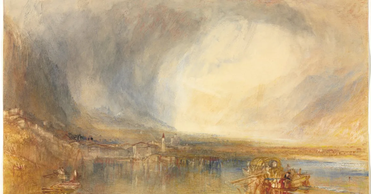
- The Cleveland Museum of Art: J. M. W. Turner, Flüelen, from the Lake of Lucerne, 1845 (hero image, CC0)
- The Cleveland Museum of Art: J. M. W. Turner, A View from Moel Cynwich, c. 1850 (CC0)
Was this guide helpful?

Written by
Marcus ReedTechnique Editor
Marcus Reed writes Watercolor Daily's step-by-step technique guides: wet-on-wet washes, glazing, dry brush, and the water control underneath them.
NextKeep reading
Guides / 11 min
Flat Wash Watercolor Technique: Flat and Graded in 5 Steps
Guides / 12 min
Masking Fluid Watercolor Guide: 7 Steps and 3 Products
Guides / 10 min
How to Paint Snow in Watercolor: 9 Tips for Clean Whites
Guides / 9 min
Wet-on-Wet Watercolor Technique: Complete Beginner Guide
Guides / 10 min
Wet-on-Dry Watercolor Technique: Crisp Edges in 6 Steps
Guides / 11 min
Dry Brush Watercolor Technique: 8 Tips for Broken Texture
Guides / 14 min
How to Clean Watercolor Brushes: 7 Steps, 3 Ways to Dry
Features / 14 min
12 Easy Watercolor Ideas for Beginners From 3 Tubes
Disclaimer
This article is published for informational purposes and is not professional advice. Product formulations, pigment sources, packaging and store listings change. Check the details that matter to you (price, pigment content, regional availability) with the manufacturer or retailer before you buy.