Loading
Watercolor Daily · Guides
Split-Primary Palette Guide: Mix Any Color with 6 Tubes
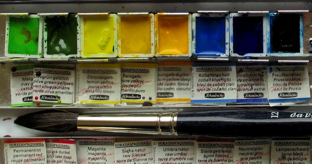
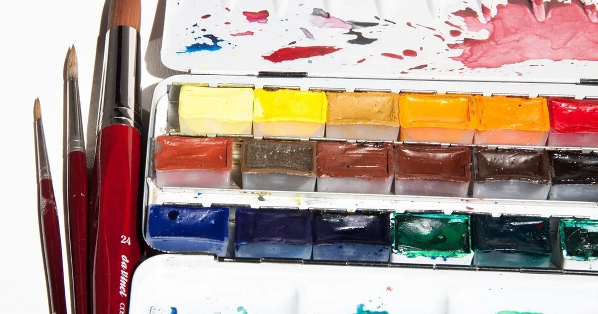
Photo: Usager des couleurs d'aquarelle, Wikimedia Commons, CC BY 3.0
A split-primary palette is six tubes of paint: a warm and a cool version of yellow, red and blue. It is the most reliable fix for muddy color. If your purples dry brown and your greens look like khaki, the problem is rarely your brushwork. It is the simple three-color wheel most of us learned at school, which ignores the fact that real paints lean toward other colors.
In short: A split-primary palette gives you two of each primary (six tubes). Mix the two paints that lean toward each other and you get clean oranges, greens and purples, because the third primary, the one that turns mixes muddy, stays out.
What is a split-primary palette? (quick answer)
Six paints: a warm and a cool yellow, red and blue. For a clean mix, pick the two that lean toward each other, such as a greenish yellow and a greenish blue for a bright green. For a softer, duller mix, pick the two that lean away from each other.
Overview: Why the Split-Primary Palette Solves the Mud Problem
Many beginners think more colors make mixing easier. A box of 24 pans often makes it harder, because many of those colors are already mixtures.
Muddy color comes from mixing all three primaries. Yellow, red and blue together cancel each other out toward gray or brown. The catch is that real paints are never a pure yellow, red or blue. Each one leans slightly toward a neighbor on the color wheel.
Say you mix a green from a warm yellow (which leans toward red) and a warm blue (which also leans toward red). You meant to mix two primaries, but you have sneaked in the third: red. Red is the opposite of green on the color wheel, so it dulls the mix toward khaki.
A split-primary palette solves this by giving you two versions of each primary, one leaning each way. Choose the pair that leans toward each other, and the third primary stays out of the mix.
The 6 Tubes in a Split-Primary Palette
You do not need rare or expensive paints. You need six reliable single-pigment paints with a good lightfastness rating, meaning they resist fading in light.
| Slot | Paint | Pigment code | Leans toward | Good for |
|---|---|---|---|---|
| Cool yellow | Hansa Yellow Light / Lemon | PY175 / PY3 | Green | Bright greens and lemon highlights |
| Warm yellow | New Gamboge / ISO Yellow | PY97 / PY110 | Red | Golden yellows and oranges |
| Warm red | Pyrrol Scarlet / Cadmium Red Light | PR255 / PR108 | Yellow | Clean oranges and scarlet reds |
| Cool red | Quinacridone Rose / Magenta | PV19 / PR122 | Blue | Pinks and purples |
| Warm blue | French Ultramarine | PB29 | Red | Purples and textured skies |
| Cool blue | Phthalo Blue (Green Shade) | PB15:3 | Green | Turquoise, sea greens and cool shadows |
What "warm" and "cool" mean here
Warm and cool only describe which way a color leans:
- Yellows. Hansa Yellow Light is cool because it leans slightly green. New Gamboge is warm because it leans toward orange.
- Reds. Pyrrol Scarlet is warm, like a tomato, because it leans toward yellow. Quinacridone Rose is cool, like a pink peony, because it leans toward blue.
- Blues. French Ultramarine is warm because it leans toward purple. Phthalo Blue Green Shade is cool because it leans toward green.
Good paper helps these differences show. Colors look duller on wood-pulp paper than on the cotton sheets in the best watercolor paper for beginners guide.
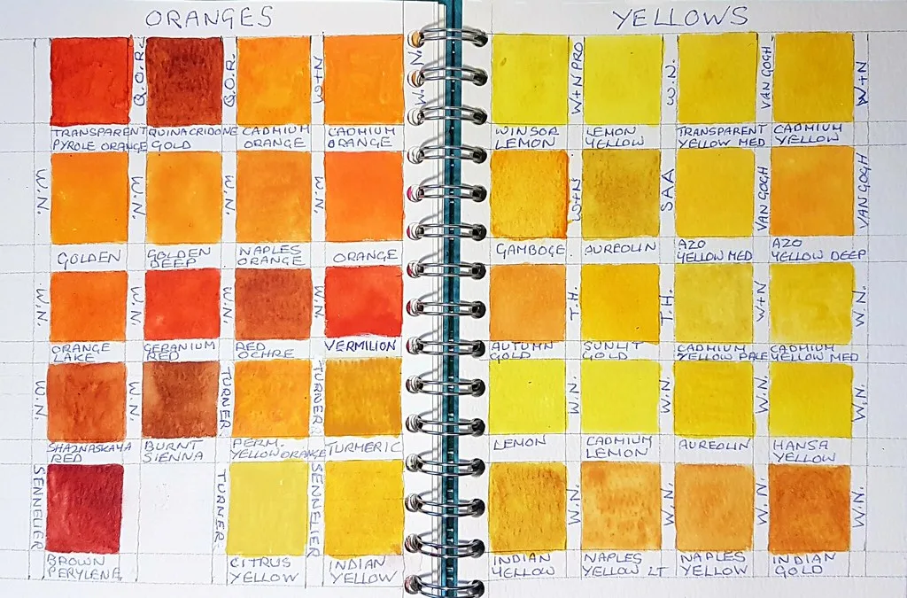 CharmaineZoe's Marvelous Melange, CC BY 2.0 via Flickr. A painter's swatch book of yellows and oranges. Cool lemon yellows sit on the top row, warmer gamboge and gold yellows below, the split this palette is built on.
Mixing Formulas: Bright Colors and Soft Colors
Each secondary color has a bright recipe and a soft one.
Oranges
- Bright: warm yellow (New Gamboge) + warm red (Pyrrol Scarlet). Both lean away from blue, so the orange stays clean and strong.
- Soft: cool yellow + cool red, for peach and muted terracotta.
Greens
- Bright: cool yellow (Hansa Yellow Light) + cool blue (Phthalo Blue). Both lean toward green, so there is no red to dull it. This gives fresh spring greens and sea-glass greens.
- Soft: warm yellow + warm blue. The red lean in both calms the green into olive, sage and forest greens, which often look more natural in landscapes.
Purples
- Bright: cool red (Quinacridone Rose) + warm blue (French Ultramarine). Both lean toward purple, so there is no yellow to dull it.
- Soft: warm red + cool blue. The yellow in the red pulls the purple toward slate gray and mauve.
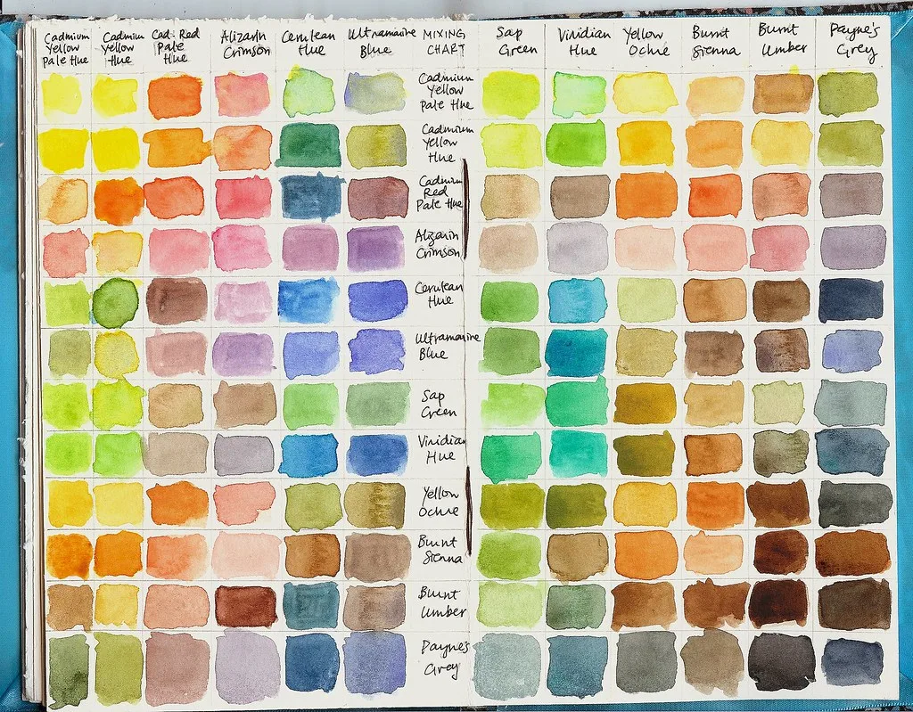 denn, CC BY-SA 2.0 via Flickr. A mixing chart that crosses every color in a set with every other one. Painting one for your own six tubes shows which pairs stay clean and which turn muddy.
GODEEPER: You can also mix on the paper by dropping one color into another while both are wet. The wet-on-wet guide covers how wet the paper should be. Wet-on-Wet Watercolor Technique: Complete Beginner Guide →
Mixing Skin Tones and Rich Darks
The same six tubes also mix subtle skin tones and deep shadows.
Skin tones
You do not need a tube labeled "flesh". Mix your own:
- Base: a watery mix of Quinacridone Rose and New Gamboge gives a warm, light base.
- Shadows: add a tiny touch of Phthalo Blue or French Ultramarine to darken it while keeping it clear.
- Warm accents: a very thin layer of Pyrrol Scarlet over cheeks, ears and lips.
Darks without black
Black from a tube can look flat. French Ultramarine (PB29) mixed with Burnt Sienna (PBr7) makes a dark with more life in it. Add more blue for a cool winter midnight sky, or more brown for a warm, coffee-colored shadow. Ultramarine also granulates, meaning its pigment settles into the paper's grain, which gives the shadow a soft texture.
Step-by-Step: Painting Your First Split-Primary Swatch Chart
A swatch chart on cotton cold-press paper is the fastest way to learn your paints.
1. Set up the sheet. Tape down a sheet of 300 gsm cotton cold-press paper and draw a simple grid with a pencil, with room for each tube and each mix. 2. Paint each tube on its own. Paint a swatch of all six paints, unmixed, around the edge. These are your reference colors. 3. Mix the bright secondaries. Mix warm with warm and cool with cool, in roughly equal amounts, to make a bright orange, green and purple. 4. Mix the soft versions. Now mix the opposite pairs, such as warm yellow with warm blue, and see how the hidden third primary softens each color. 5. Make a light-to-dark ladder. Take each bright mix and paint five swatches, adding more water each time, from full strength to a pale tint.
GODEEPER: Painting one thin, clear layer over another, once the first is dry, mixes colors on the paper too. The wet-on-dry guide shows how to tell when a layer is dry enough. Wet-on-Dry Watercolor Technique: Crisp Edges in 6 Steps →
Tips: Arranging Your Split-Primary Palette
How you lay out your paints affects how easily you mix:
- Keep each warm and cool pair side by side. Hansa Yellow Light next to New Gamboge, Pyrrol Scarlet next to Quinacridone Rose, French Ultramarine next to Phthalo Blue.
- Follow the color wheel. Arrange the wells around your mixing area in order: yellows, then reds, then blues.
- Give each mix its own well. Keep one well for greens, one for oranges and one for purples, so stray blue never ends up in your orange.
If you compare brands such as Daniel Smith watercolors, check the pigment code on each tube. Paints with a single pigment behave predictably whichever brand makes them. Starting with cheaper student paints is fine too, as long as you check that each one is a single pigment.
Frequently Asked Questions
What is a split-primary palette in watercolor painting?
A palette of six paints: a warm and a cool version of each primary color, yellow, red and blue. By choosing the two paints that lean toward each other, you can mix clean greens, oranges and purples without accidentally adding the third primary, the one that makes mixes muddy.
Why do my secondary colors (greens, oranges, purples) turn muddy?
Usually because all three primaries ended up in the mix. Most paints lean slightly toward another color. A yellow that leans red, mixed with a blue that also leans red, sneaks red into your green, and red dulls green toward brown. Pick the yellow and blue that both lean green instead.
Which 6 watercolor pigment colors make up a classic split-primary set?
A common set is Hansa Yellow Light (cool yellow), New Gamboge (warm yellow), Pyrrol Scarlet (warm red), Quinacridone Rose (cool red), French Ultramarine (warm blue) and Phthalo Blue Green Shade (cool blue). Each is a single-pigment paint, so mixes stay predictable and clean.
Can you mix black and gray using a split-primary palette?
Yes. French Ultramarine (PB29) mixed with Burnt Sienna (PBr7) makes rich darks and grays, and so does a strong mix of a red and a blue. These mixed darks look livelier than black from a tube, and you can push them warmer or cooler as the painting needs.
Is a split-primary palette better than a 24-pan watercolor set?
For learning to mix, usually yes. Six single-pigment paints teach you how colors combine, and the mixes stay clean. A large set saves mixing time, but many of its colors are already mixtures of several pigments, which turn muddy when you mix them again.
Related Reading
- Essential Beginner Watercolor Supplies: The Complete Starter Kit
- Daniel Smith vs Winsor & Newton: Professional Watercolor Review
- 12 Easy Watercolor Christmas Card Ideas for Beginners
- Single pigment, defined in the Watercolor Daily glossary
References
- Handprint: The Geometry of Color and Mixing Palettes - Bruce MacEvoy on watercolor color wheels and color bias.
- ASTM D5067 Standard Specification for Artists' Watercolor Paints - The standard for watercolor lightfastness and labeling.
- Winsor & Newton: Understanding Color Temperature and Primary Triads - The maker's guidance on warm and cool primaries.
Was this guide helpful?

Written by
Elena VancePigments & Color Editor
Elena Vance writes Watercolor Daily's pigment and color coverage: Colour Index codes, lightfastness ratings, transparency, and palette building.
NextKeep reading
Features / 12 min
Granulating Watercolors Explained: 7 Pigments That Settle
Guides / 12 min
Glazing Watercolor Technique: 6 Steps to Layer Clean Color
Features / 14 min
12 Easy Watercolor Ideas for Beginners From 3 Tubes
Features / 12 min
Ceramic vs Plastic Watercolor Palette: 5 Differences
Guides / 11 min
Dry Brush Watercolor Technique: 8 Tips for Broken Texture
Guides / 14 min
How to Clean Watercolor Brushes: 7 Steps, 3 Ways to Dry
Guides / 11 min
Flat Wash Watercolor Technique: Flat and Graded in 5 Steps
Guides / 12 min
Masking Fluid Watercolor Guide: 7 Steps and 3 Products
Disclaimer
This article is published for informational purposes and is not professional advice. Product formulations, pigment sources, packaging and store listings change. Check the details that matter to you (price, pigment content, regional availability) with the manufacturer or retailer before you buy.